Google releases source code for Google I/O 2019 for Android
Today we're releasing the source code for the official Google I/O 2019 Android app.
This year's app substantially modified existing functionality and added several new features. In this post, we’ll highlight several notable changes.
Android Q out of the box
- Gesture navigation
Android Q introduced an option for fully gestural navigation, allowing the user to navigate back and to the home screen using only gestures. To support gesture navigation, app developers need to do two things:
- Extend app content to draw edge-to-edge
- Handle any conflicting app gestures
The Google I/O 2019 app was one of the first apps to support fully the gestural navigation. For more details, check out this series of blog posts about gesture navigation and the commit in the Google I/O app repository that extended the content to draw edge-to-edge.

- Dark theme
Another new feature that was introduced with Android Q was the new system Dark theme that applies to both the Android system UI and apps running on Android devices. Dark theme brings many benefits to developers, including being able to reduce power usage and improving visibility for users with low vision and those who are sensitive to bright light.
To support the dark theme, you must set the app’s theme to inherit from a dark theme.
<style name="AppTheme" parent="Theme.AppCompat.DayNight">
OR
<style name="AppTheme" parent="Theme.MaterialComponents.DayNight">
You also need to avoid hard-coded colors or icons. You should use theme attributes (such as ?android:attr/textColorPrimary) or night-qualified resources (such as colors defined both in the res/values/colors.xml and res/values-night/colors.xml) instead. Check out the Google I/O talk about Dark Theme & Gesture Navigation for more details or the series of commits (1, 2, 3) in the Google I/O 2019 app repository for how we achieved implementing the dark theme in a real app.

Improved schedule screen
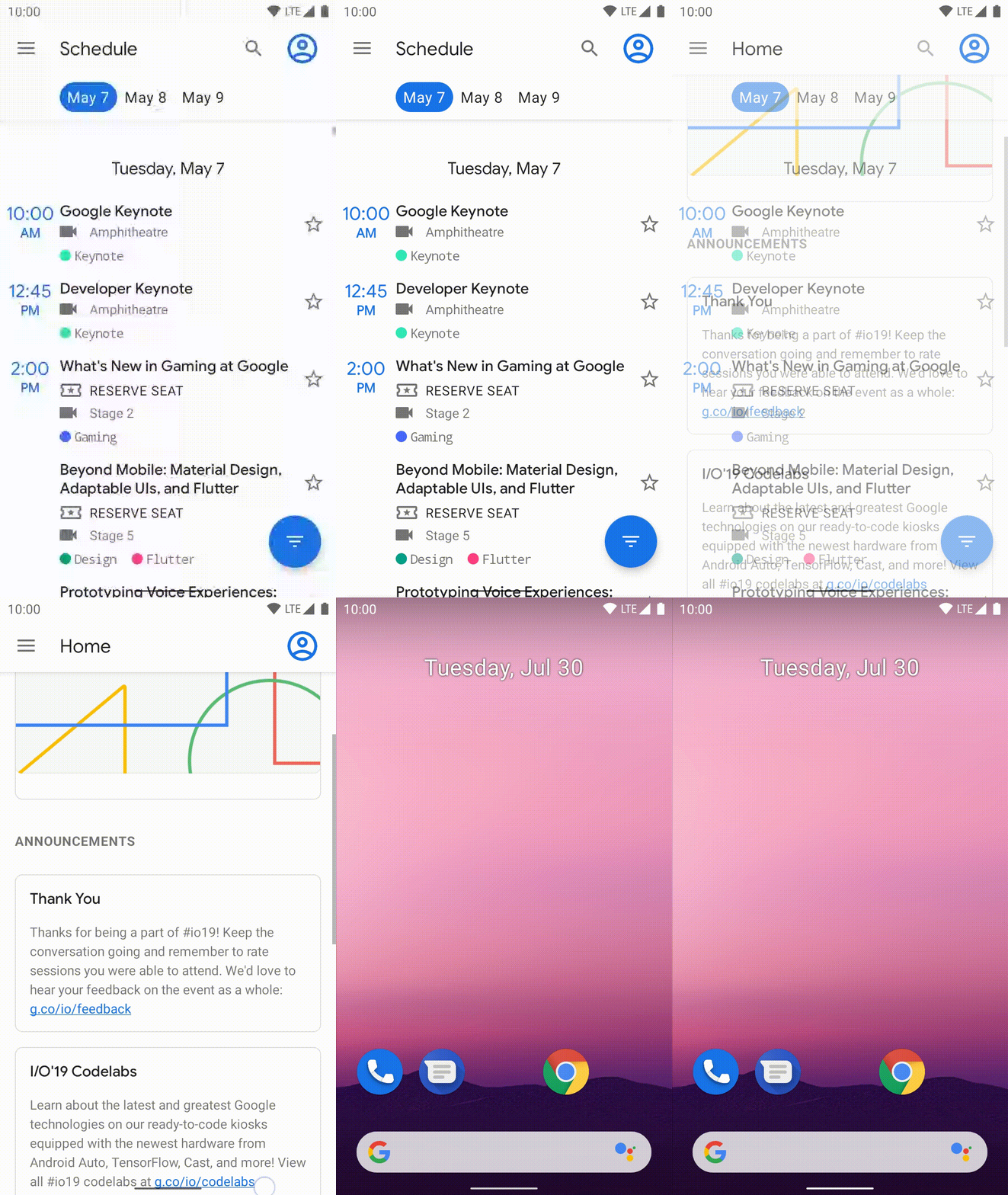
In 2018, we adopted a tabbed interface for the schedule UI with horizontal swiping, each tab represented a conference day. In 2019, we changed the UI to address some usability and performance problems. For example, the views in the all tabs were rendered at the same time when the schedule UI became visible. That caused a noticeable UI slowdown especially on a low-end device.
The new schedule UI is a single stream, allowing the app to render only visible content and users to easily jump to another conference day by choosing a day at the top of the UI. Check out the series of commits (1, 2) for how we revamped the schedule UI.

This year’s schedule UI jumping to another conference day
Navigation component
We introduced Navigation component to simplify this year’s app into a Single Activity app and observed the following benefits:
- Being able to see all the transitions at a glance in the navigation editor which simplified launching Session Details and the Map from launch actions
- Removed boiler plate code for handling up and back navigations
- Arguments between Fragments were statically typed by using the Safe Args gradle plugin
Check out the getting started guide for how you can start introducing the Navigation component in your app and the series of commits (1, 2, 3, 4) in the Google I/O 2019 app repository for the usage in a real app.

Full Text Search with Room
For this year’s app we added a search feature for users to quickly find sessions, speakers, and codelabs. To accomplish this, we used the Full Text Search feature of the Room Jetpack component. Whenever the conference data is fetched from the server, we update the session, speaker, and codelab data in the Room tables, which have corresponding FTS mapping tables. When a user starts typing in the search box, the search term is used to query the session title and description, speaker names, and codelab title. The search results are shown almost instantly, which allows the search results to be updated with each character typed in the search field. The user can then tap on a search result to navigate to see the details on the session, speaker, or codelab. Check out the series of commits (1, 2, 3, 4) for how we achieved the Full Text Search feature.

Lots of improvements
These were the biggest changes we made to the app, but we improved a lot of little things as well. We added the new Home UI, allowing the app to tell the user time relevant information during the conference and the Codelab UI, which gave users more information about codelabs at I/O and how to participate in them.
We also introduced Firebase Remote Config to toggle the visibility of each feature by updating the boolean values in the Remote Config without updating the app and removed the hard-coded values that were used for representing start and end time of each event in the Agenda UI.
Go explore the code
If you’re interested go checkout the code and let us know what you think. If you have any questions or issues, please let us know via the issue tracker on GitHub.


Komentar
Posting Komentar